
Technical drawings that actually work
The right kind of technical drawings should make your engineering work easier, eradicate coding mistakes, create a linkage to your acceptance criteria and be understandable by your customer.

Being intentional about your drawings
I’ve seen a lot of technical drawings. I’ve been witness to religious wars about one style over another. I’ve seen engineering teams melt down over which arrow directionality means “input” versus “output.”
It can be a contentious topic — perhaps understandably so.
Adopting one kind of drawing style over another imposes a particular style on our architecture as well. Our drawings influence our architecture. If we use an object oriented notation, we’ll likely design a system based on objects. A style that’s heavily relational, we’ll probably put business logic in the database.
Our drawing style shouldn’t lock us into a predetermined technical approach.
That’s why we need to be really careful about our technical drawings.
I like technical drawings that are unambiguous, easy to read and easy to maintain. The drawings need to be understandable by everyone, including your customer. That’s essential — because the moment part of your team can’t follow along, it’s useless.
What’s more, the right style is going to add value to your project by:
Adding fidelity to business processes, in a way that the customer, product owner, and business can validate. It can’t be indecipherable technical jargon.
Being compatible with how we model business events, extending ideas about event modeling and contextual boundaries.
Extending validation criteria; in other words, it should model the acceptance criteria that proves we delivered the right thing.
Working well with all of our engineering requirements (not creating an impedance mismatch as we try to translate into a different domain or technology).
For the past decade or so, I’ve been using two specific types of diagrams. This is all I’ve needed across many domains and many project sizes.
I’ve chosen these two drawing types to meet two specific needs:
The first adds functional detail to complex business processes, so we can see exactly how these processes will be implemented and tested.
The second makes it easier to reason about complex interaction sequences between disparate components in complex systems.
#1. Architectural marble diagrams
Marble diagrams are a visual way to represent behavior. They align well with event modeling because they model streams of information using a timeline-based format. They use symbols to depict the emission of values, completions, and errors. A marble diagram represents an “observable source” with a timeline and demonstrates how information is transformed and ultimately emitted.
Marble diagrams are event oriented, so they fit well with event streaming architecture. Here’s a quick synopsis of terminology that’s frequently used in marble diagrams:
“Observable.” A thing that can be observed to be true or false; basically, something we can validate as correct. An “observable source” is just where an observable thing comes from.
“Operation.” Some kind of a process or function that we can apply.
“Value” and “event” are, respectively, discrete properties and some concrete thing that has happened and can be recorded.
It sounds a lot like an event driven architecture, making marble diagrams a great way to model a business process. It essentially takes an input, shows how the input changes over time, and what is ultimately output. If you’re following my playbook that formula should sound familiar.
A marble diagram, in a nutshell, looks like this:
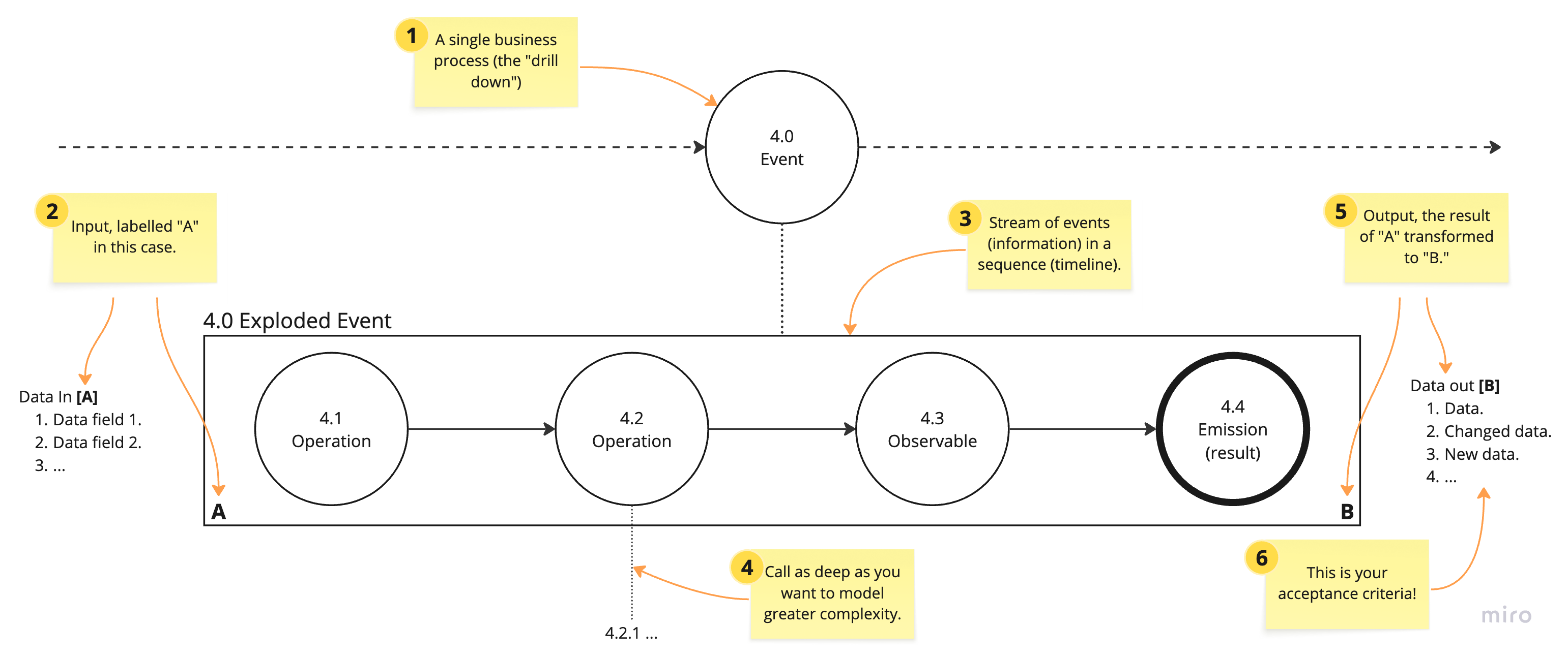
Here’s a quick explanation. Each of the numbered post-its in the diagram correspond to the explanation below:
A business event from your tactical event map. If your diagraming tool supports it (Miro does), create a bidirectional link — allowing you to navigate between your tactical map and marble diagram with a click.
The input to a function is identified with a letter. In this case, the data set “A” is an input to the “4.0 Exploded Event” function.
Each function is represented as a sequence of “marbles” along a timeline. Individual marbles represent values, functions or “observables,” and emitted values. An emitted value could be a result, a signal or an error.
We can add another layer to explode further complexity — it’s “marbles all the way down.” You can think of each layer like another layer in the call stack. But, not necessarily literally; you model added complexity as you need by increasing depth.
Once the input has been transformed to a result, it’s no longer an “A” data type. It becomes a new type, here noted with a “B.” The “B” simply represents a new data set, in this case output from the “4.0 Exploded Event” function.
One of the things I love about marble diagrams is the representation of the result in your diagram. The output value, “B,” is your acceptance criteria. It connects your technical drawings directly to the specifications.
As you can see marble diagrams fit very well into an event driven architectural model.
I’d really appreciate it you could refer a friend. Plus, three referrals and you earn a free month!
The drawing style is easy to adapt and expand upon. You can add annotations and, of course, other shapes and icons to add specific meanings to your design.
And the value of point number 6 cannot be understated: the representation of your data in your design specifications is powerful. We’ve clearly carried our requirements forward, showing business inputs, how we will transform those inputs and then showing the output. The output, then, is your acceptance criteria — it effectively shows us exactly what we must test to validate our work.
Let’s walk through a real-world example. Here’s a simple event map that I’ve annotated by numbering the events — a better alternative would be to use clickable links, which would make numbering unnecessary:
What we want to do is explode the “4.0 Loan prequalified” event, adding more fidelity to that specific card.
I’ve added some annotations to help explain the example diagram below, along with a legend:
The marbles now have two styles. The bold style indicates an event has been emitted, for instance, writing the output value to a Kafka event queue.
Notations for logging, blocking function calls and retries have been added.
Other shapes are shown in the legend. Marble diagrams are flexible; you should feel free to add annotations whenever it adds clarity to your designs.
This example shows the specific steps performed in prequalification:
